Every brand with a skull logo thinks they have something nobody else has. Most of them don't. A skull is just a shape until you give it a reason to exist on that specific shirt, for that specific customer, for that specific reason.
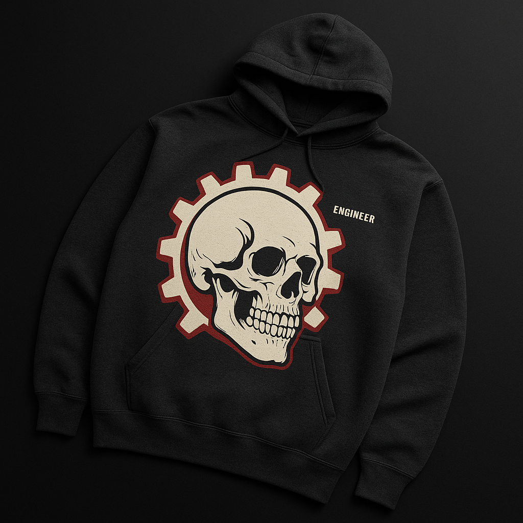
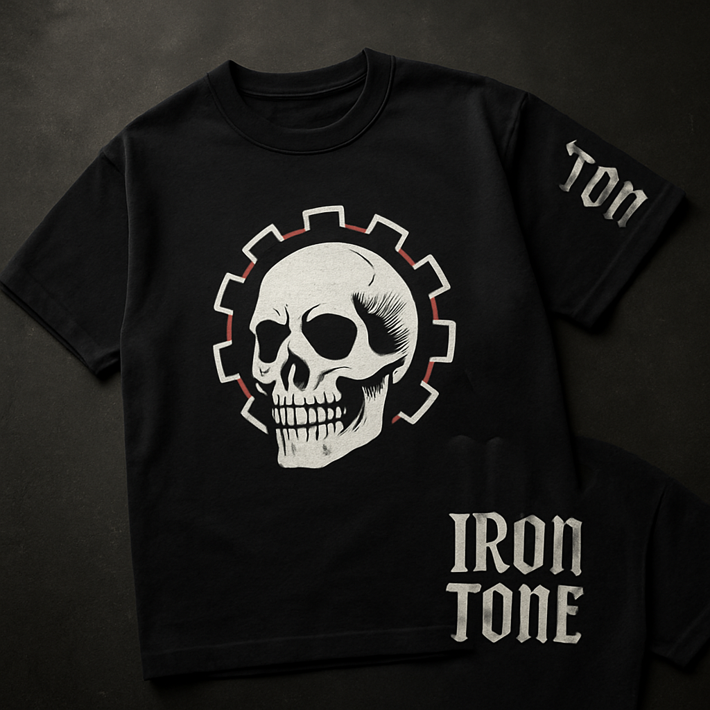
The IronTone skull-and-gear came from one constraint: the brand isn't about metal music in the abstract. It's about the physical act of improving a guitar. The gear — a machine gear, not a music gear — is the hardware side. The skull is what's underneath after the work is done. Not death imagery. More like: strip it down to the mechanism, and this is what's left.
The Brief: No Separate Elements
The initial concepts were all wrong in the same way. Skull on the left, gear on the right. Skull behind gear. Gear framing skull. Everything treated the two elements as separate objects in composition.
The breakthrough was making them structurally inseparable. The gear teeth grow out of the skull's cheekbone. The gear shaft goes through the orbital socket. One object, not two objects arranged near each other. That's the difference between a logo that reads as "metal merch" and one that's actually distinctive.
It took three rounds. First round: too decorative, too many small details that would disappear when silk-screened. Second round: better structure, but the gear was too dominant and the skull read as secondary. Third round: skull forward, gear integrated, red accent stroke on the gear teeth for depth. That's the one.
Why Screen-Print Over DTG
Direct-to-garment (DTG) printing has gotten very good. The equipment is faster, the minimum order quantities are lower, and the color matching is tighter for photographic art. For a logo that's three colors — white, black, red — screen-print wins on every other metric.
Screen-print inks sit on top of the fabric. After washing, the hand — the feel of the print — stays slightly raised and tactile. DTG ink soaks into the fiber. Both fade eventually, but screen-print fades evenly and stays readable. DTG can go patchy on heavyweight cotton because the fiber weave resists ink penetration at high GSM counts.
The IronTone Logo Tee uses 100% heavyweight cotton at 200GSM. That weight absorbs punishment and hangs well after years of wash cycles. It's not a fashion-weight 150GSM that goes tissue-thin after eighteen months. Spec the shirt to last, then print it to match.
The Hoodie Variant
The Riff Hard Hoodie takes the same skull-and-gear and scales it up — full back print, oversized, in off-white on charcoal heather. Different application, different outcome. The hoodie print is meant to be read from across a room. The tee print is more chest-level, immediate, conversation-starter size.
The charcoal heather base was a deliberate choice over solid black. Black absorbs ambient light and makes large prints flatten out. Charcoal heather has slight tonal variation in the fabric that gives the white print a subtle depth it wouldn't have on flat black. It photographs darker than it appears in person — in person it reads as a warm medium gray that works in daylight or under stage lights.
What Comes Next
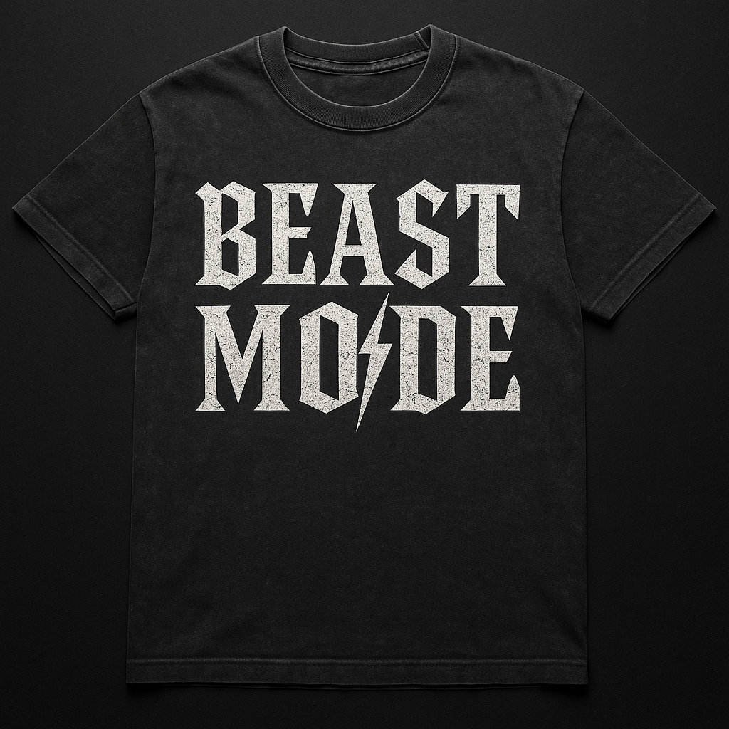
The Beast Mode Tee runs a different design brief — vintage wash, cracked-ink, distressed feel. More about texture than structure. The next screen-print after that will be a full back panel on a long-sleeve, with original artwork from a Forge-featured artist. That's the template: shirts that double as gallery pieces for the artists on the platform.
When that drops, you'll hear about it first if you're on the Forge list. First in line, first to ship.
— CHUKK